
April 2020 - May 2020
My Role:
As an independent project, I was responsible for all aspects of the project including the development process.
Tools:
WordPress
Skills Applied:
Sketching, UX Design, CSS, Branding
For my final project in my Web Development course, I chose to recreate a website made for a UGA domestic study abroad program called the Interdisciplinary Field Program (IFP). The IFP is an 8-week long camping journey through the American West and back. The original IFP website included an overwhelming amount of pages (19 pages, to be exact) and within each of these pages were large amounts of text. My goal was to create a condensed website without getting rid of a single amount of information. As a result, I was able to turn a 19 page website into 7 pages without omitting any information by incorporating organized UI components that range from accordions, an interactive map, and flip boxes.
Last summer, I had the privilege to take part in this amazing program. I remember the first time when I took a look at their original site, and I was completely overwhelmed. Almost every page was filled with paragraphs upon paragraphs of information and almost no other content was included. As a prospective participant, I was required to review the entire site and its information to learn about what to expect on the trip. Although every bit of information was important and necessary to read, the layout of the website made me very nervous for this trip due to its overwhelming set up and the easiness it was to get lost or miss information.
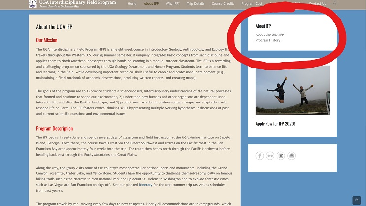
This project proved to be very challenging because I really did not realize how many pages the original website had. If you take a look at the about page on the original IFP website, to the right in its sidebar area, you will see a box of hyperlinks that lead to new pages that are not even located in the main menu or anywhere else. In fact, each page on the main menu has one of these confusing little submenus in their sidebars. This caused a lot of back arrows and hunting for the right page I wanted. In total, the original website has 19 pages, so saying that I had a lot of work to do is sort of an understatement.
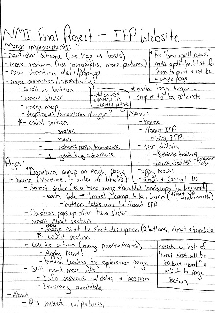
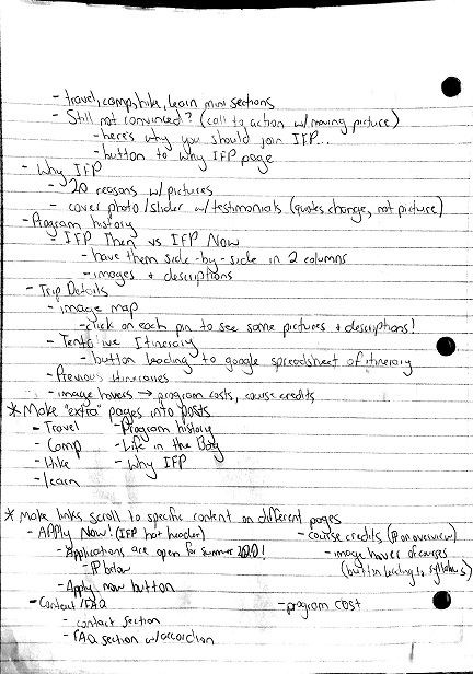
While recreating this website, I had to brainstorm how I would like this website to be organized before I even began to use WordPress. There was just so much that I had to work with! Therefore, I wrote down a list of improvements as well as a quick layout of what I would like on each page of the new website so I wouldn't overwhelm myself with different tasks. I also researched possible plugins to be included and wrote them down under “more animation/interactivity.” Planning out my website before starting really saved my life and made working on this website a lot easier. Plus, I felt like a true website developer!
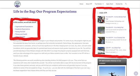
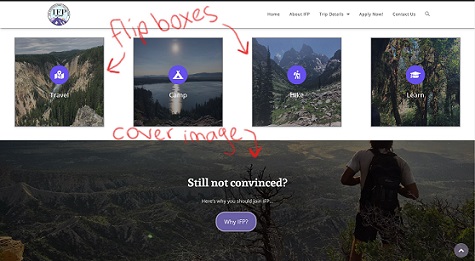
I knew I could not condense all of the information on the origianl site because it was all so important. Therefore, I decided to create posts with the information that felt very long. For example, on the original site, under the trip details page, there is another one of those weird boxed menus located on its sidebar. One of the hyperlinks is named Life in the Bag. I took all of the information on the Life in the Bag page and made it into a post. Therefore, all of the information is located in that one spot, but it looks like an article to read rather than a mush of paragraphs on a website page. I also spiced the post up by adding videos and pictures to get viewers excited about the trip. The title, Life in the Bag, did not necessarily address what the information was about, so I added “Program Expectations” to it. I also made a little submenu just below the title that will take the viewer to whatever part of the information they’d like to hear about such as what “fitness and health” is expected to be on IFP. As for the sidebar of the post, I chose to include all of the posts that are within this website so viewers can easily read one after the other if they please. If they choose not to, each post is located on one of the pages either as an image flip box or cover image so that it gets the attention of the viewer.
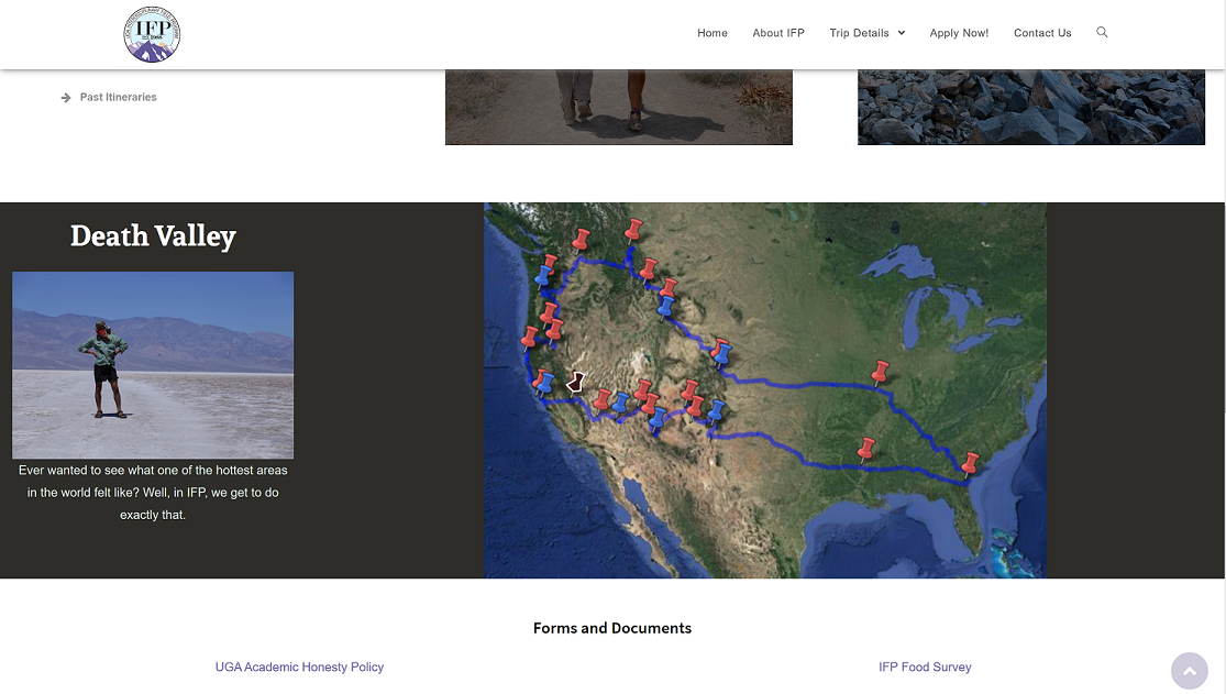
There are so many things that I learned from this project. I gained helpful habits such as planning ahead and writing down my ideas before diving right into the project. In addition, I learned how to properly research plugins on the Internet rather than relying on the WordPress search bar. I would try multiple plugins until I found the correct one. Shortcodes became an unexpected use within my website and I learned how to manipulate its code through my own html and css. Many of my plugins involved copying a shortcode and pasting it onto the page. Something that I am so excited about is the image map on my trip details page. When I first saw the image of the IFP map route on the original site, I wanted to see more pictures and details about each stop represented by a push pin. After doing lots of research, I came across the draw attention plugin which allowed me to highlight each pushpin on the map and when a user clicks on it, they can see a brief description of the stop as well as an image.
Overall, this project was one of the most difficult and time consuming, but I feel so rewarded for the work that I have put in it and how the final product turned out. I was able to turn a 19-page website into a 7-page website without omitting a single piece of text from the original site. I feel as if this project helped me create a great step by step process when it comes to building websites. It has also helped me dip more than just my toes into the world of design and asthetics. Before this project, I will admit, I really disliked WordPress. But now, I have grown a liking to its abilities and I have complete confidence on how to work with it. I have finally found a way to work together with WordPress rather than letting it overrun me.