

August 2022 - May 2023
Team:
3 Emerging Media graduate students
My Role:
Client outreach and UX Designer/Researcher
Tools:
Adobe XD, Google Forms, WordPress
Skills Applied:
Product Development, UX Design, User Research, Usabiilty Testing, Design Iterations, Client Relationships
Royal Change is a fitness apparel and equipment company run by Sydney Houdyshell, a global influencer with over 1.4 million subscribers on her YouTube channel. The company offers a wide variety of fitness products including a paid subscription to a private Facebook community called the Sydney Squad.
As a quickly growing company, Royal Change’s current website lacks the capacity to provide a meaningful user experience as it runs on Weebly, a web-building platform with limited features.
In August 2022, my team and I reached out to Sydney and formed a client relationship with her and her husband, Dustin. From there, my teammates and I went through the entire product development process, from user research to design iterations, in order to create a brand new digital experience for Royal Change.

When speaking with the Houdyshells for the first time, our team had no idea what to expect, but they laid everything out to us quite clearly. They both do not like the current look of the Royal Change website, and to put it in nicer terms than what they explained: It’s simply “out-of-date.”
In addition, Dustin described the Sydney Squad Facebook group as “messy and disorganized.” He has a hard time scrolling to find important content he and Sydney post, and he can only imagine how that pain point impacts their members. There’s just no easy way on Facebook to separate the information his members pay for and their group discussions.
Our solution began with understanding the problem that was given to us. With the Houdyshells' approval, we sent out a survey to over 3,000 Sydney Squad members to get a better idea of both who their users were as well as pain points they experience on the website and Facebook group.
As a result, we recieved over 600 responses of both qualitative and quantitative data about members and their experience with Royal Change.
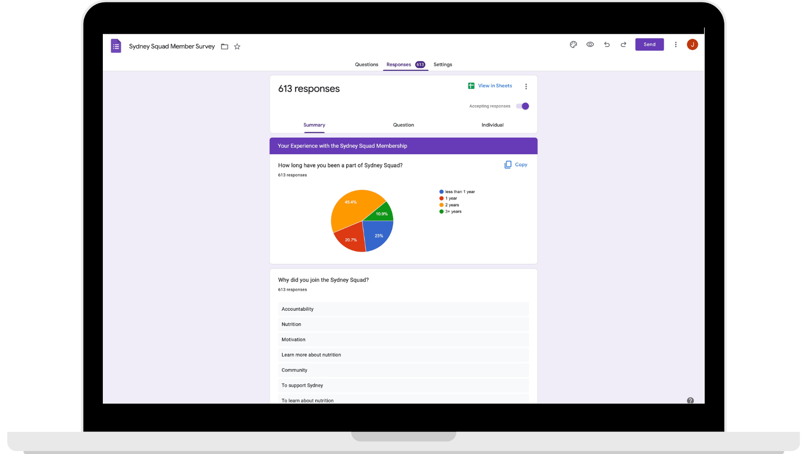
The majority of the members' responses matched the Dustin's concern with regards to the Sydney Squad interface on Facebook.
"Using Facebook as the primary platform isn’t very accessible. A lot of Sydney’s contributions get hidden or bogged down with so many other posts by other members of the Squad."
"I don’t have time to sift through Facebook to find all of Sydney’s content mixed in with everyone else’s personal/group posts."
- Sydney Squad members
Utilizing the data received from user research, my team sat down together and developed a solution that could best serve Royal Change and their customers:
We propose that the Royal Change site be relocated to a WordPress server so that there is more flexibility and functionality throughout the site. Following laws of UX principles, the site will be designed with brand consistency and an improved navigation system to limit the need for user decision making.
In addition to the site-wide makeover, we propose to create a portal on the Royal Change site that Sydney Squad members can use to login and gain access to paid content. This allows the Facebook group to remain as a forum for members to communicate with one another without the worry of losing important information they paid access for.
Before diving into WordPress, I suggested to our team that we each create sketches of what we believe the structure of the website should be. We would then present our sketches and take notes on what we liked about each. By the end of our session, we had a list of characteristics that we knew would be added to the new site.
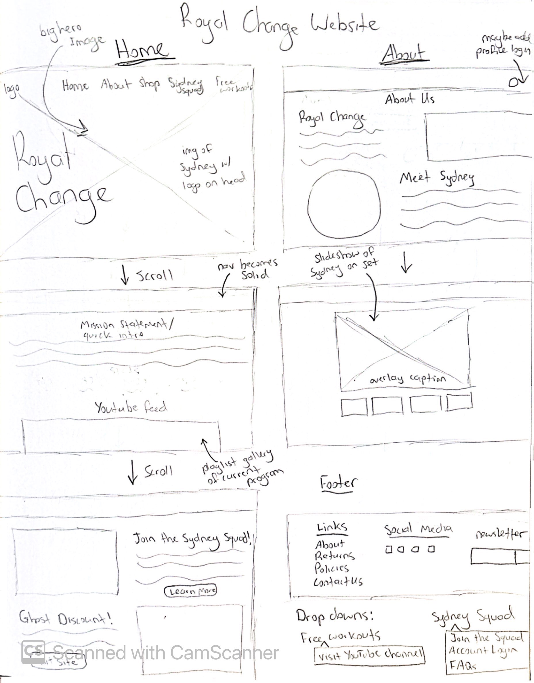
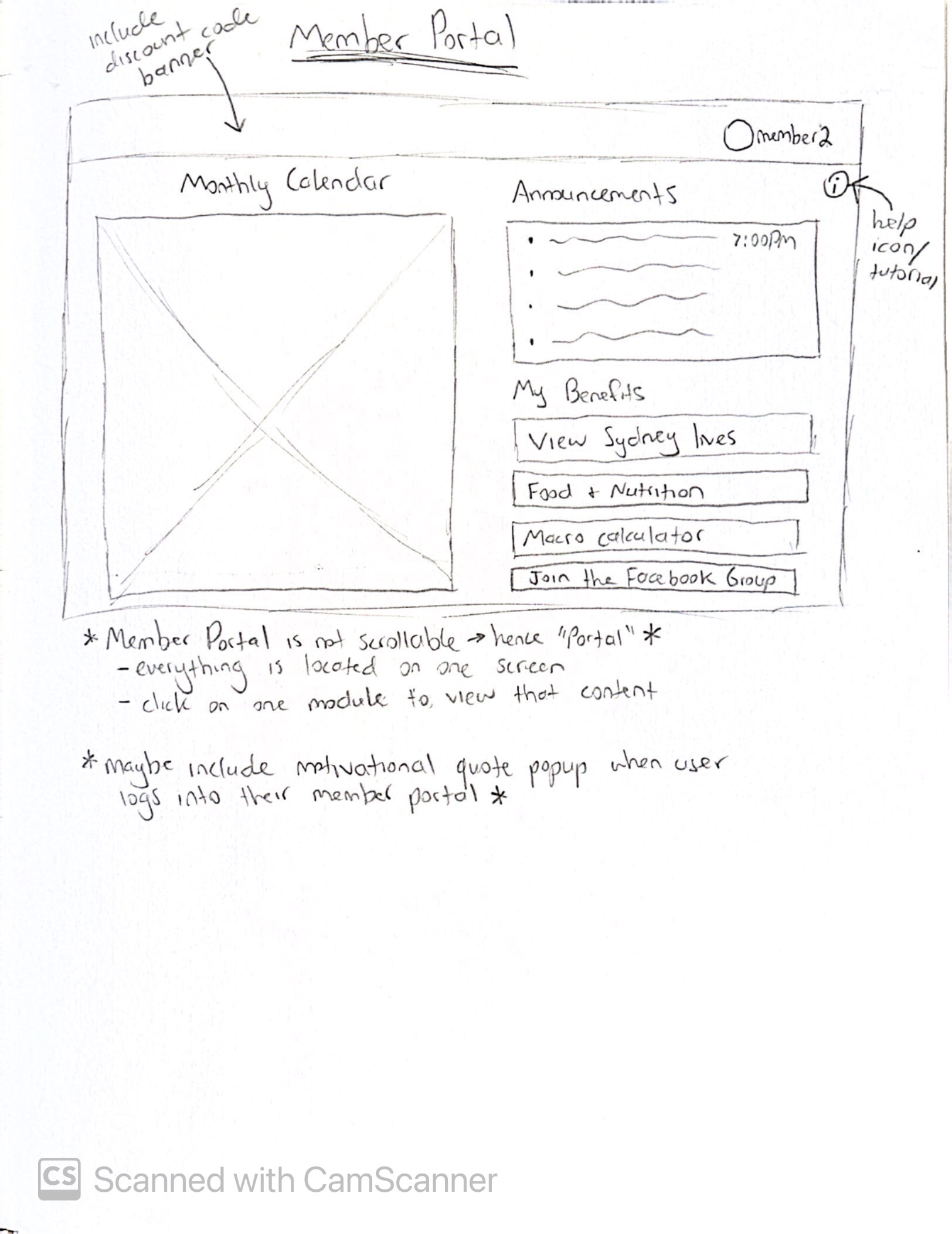
We learned early on that longevity was going to be a main point of reason behind many design decisions. We needed to make the new Royal Change website easy to use, easy to edit, and easy to upkeep for the client.
During our Alpha stage, we had several meetings with Dustin to learn more about how he envisions the new Royal Change site. We began by using his feedback, our research, and our previous sketches to create a digital wireframe made within Google Sheets. Each tab within the wireframe represents a page we wanted to add to the site. Within each tab, we listed all content that would be featured: copy, media, imagery, UI components, and plugins. We even included a section for survey evidence from our user research that we could use to back up each of our decisions. We then met with Dustin to get approval on the wireframe and we got to building our alpha.
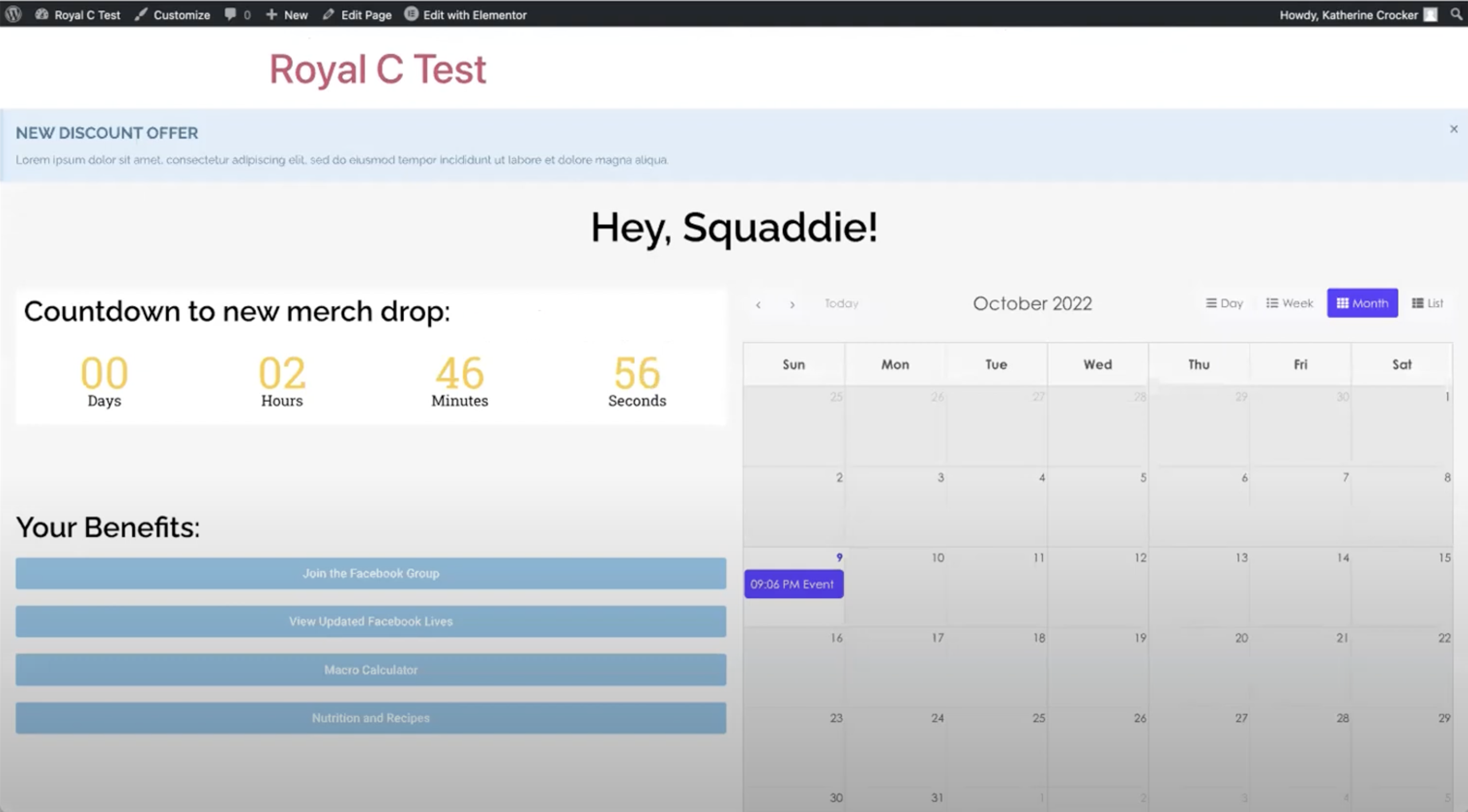
Due to the nature of working with a pre-established brand, we assumed we would have limits to making any changes to their branding. But, little did we know, Royal Change did not have any form of a design system, let alone an established color palette. We had the opportunity to revise and refresh Royal Change’s branding without the worry of sacrificing their identity.
We wanted this new design system to bring the brand to life, with the goal of creating consistency, but also leaving room for flexibility. We took inspiration from Sydney and her vibrant, high-energy personality. It was our goal to convey that same liveliness in the new color palette through the use of bright secondary colors.
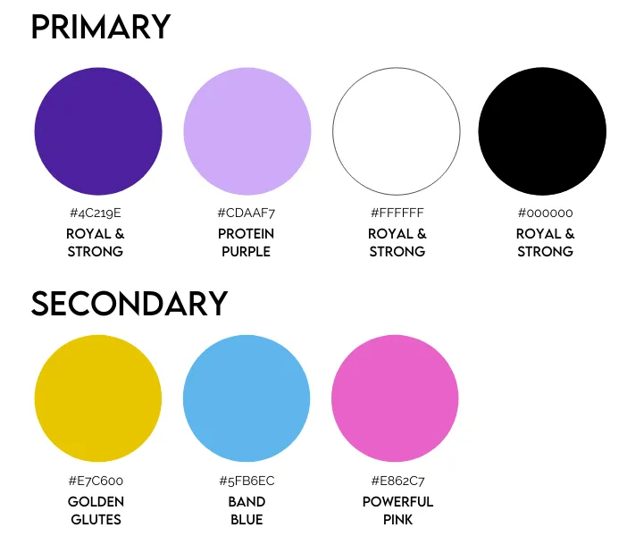
Within the design system, I was responsible for defining the imagery on the site as well as creating UI components such as accordions, buttons, and alerts that are displayed below.
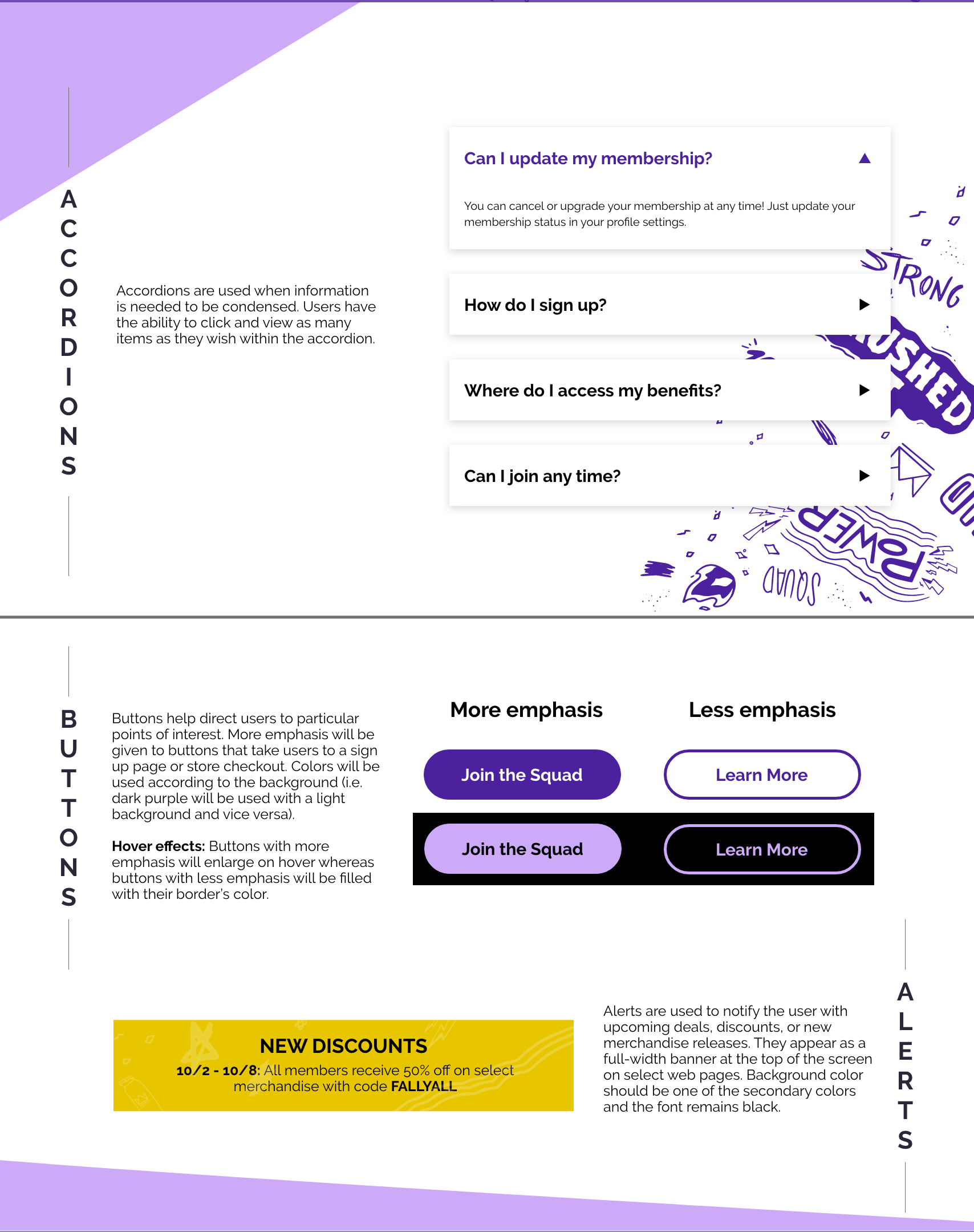
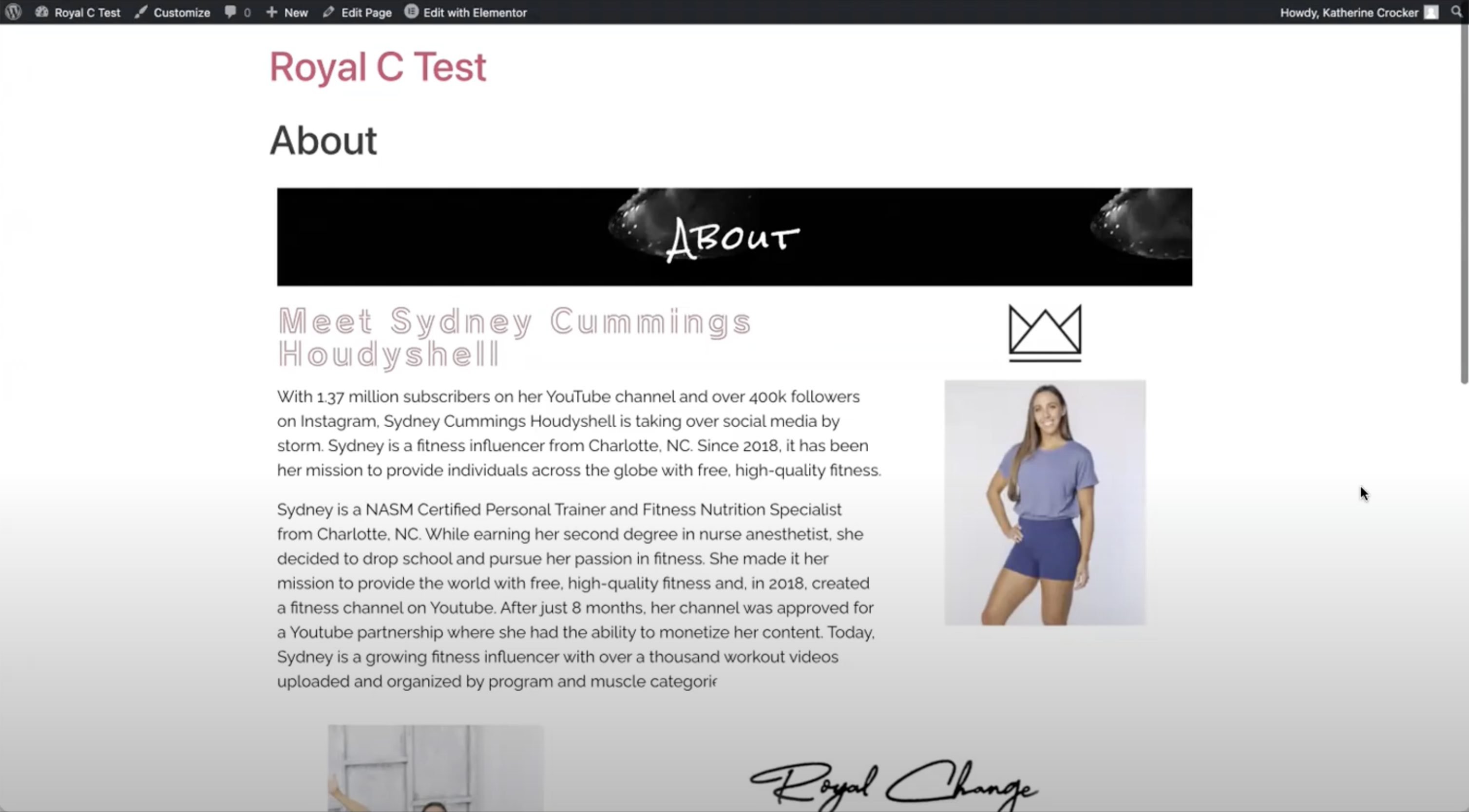
Within 2 months of the project, we created a fully functional beta version of the new Royal Change website. During this stage, we continued to build out the site while implementing the design system and boosting the site’s speed and SEO. The site also became fully responsive for desktop, tablet, and mobile devices. Everything was finally taking shape.
With our beta created, it was time to complete user testing. My team and I developed a User Testing guide that we would follow when speaking with participants. It was my job to write and develop the task questions that we would ask participants to complete as we observe their actions and emotions.
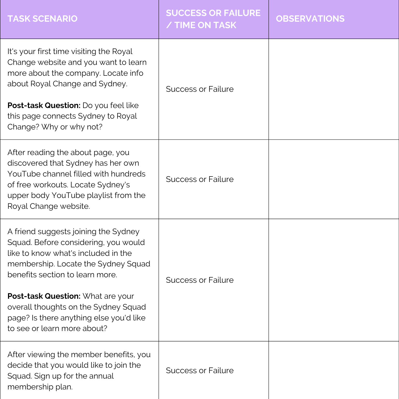
We had a total of 10 participants: 5 of whom were Sydney Squad members and the other half a mix of Royal Change employees and customers. We were beyond excited to see that the majority of participants really enjoyed the new site, from its functionality to its aesthetics. Our System Usability Scale (SUS) score indicated overall usability of the site. According to usability.gov, anything over 68 is considered above average, and our score ended up being a 93.
"I will definitely be using the new website more with all of the new features and capabilities!"
- A user testing participant
While we received lots of positive feedback, the user tests also revealed a few issues we had overlooked such as responsiveness and clickable links.
You can check out more of these findings in our User Testing Report linked to the left of this page.
After countless iterations, feedback, and hours spent staring at a computer screen, the new Royal Change website is ready to be pushed out to the public. We are incredibly proud of the work we put into this product and the many long Zoom calls spent with one another. While the live site remains password protected until Royal Change sets a launch date, you can discover more through our project website.